
280% uplift
The problem
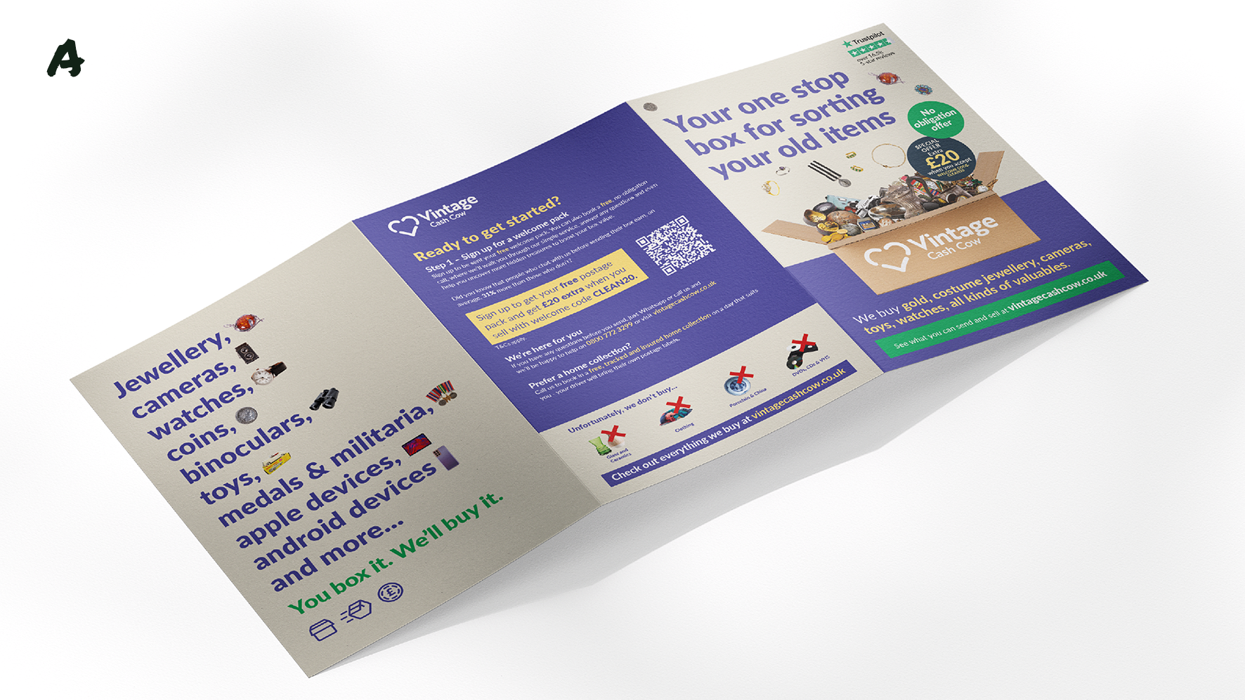
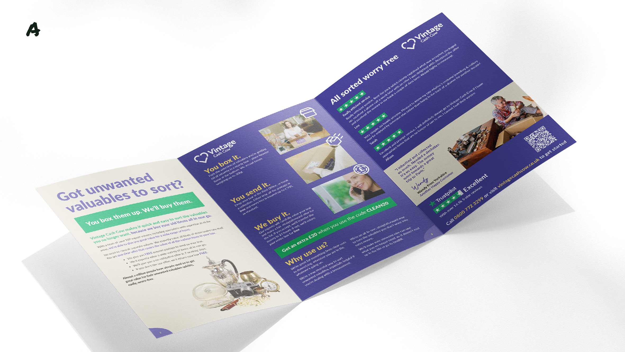
Vintage Cash Cow's door drop was leading with the mechanics — pictures of the box, how the process works, discount codes in different colours saying different things. It made the reader do all the work to figure out whether this was worth their time. Most didn't bother.
What the framework fixed
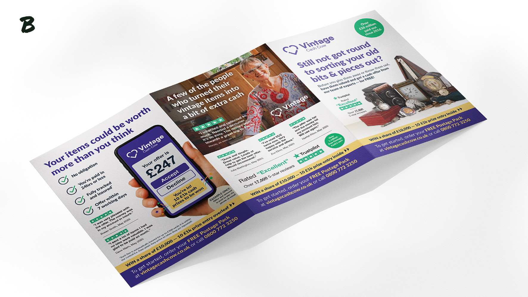
Clear: Coloured text on coloured backgrounds, small type, white-out copy for an older audience. Multiple ways of describing the same offer — "special offer code," "extra £20 when you accept," "use code CLEAN" — in different colours and different places. The reader had to decode it. The test used the same language, same colour, same placement every time: "Your £20 cash boost."
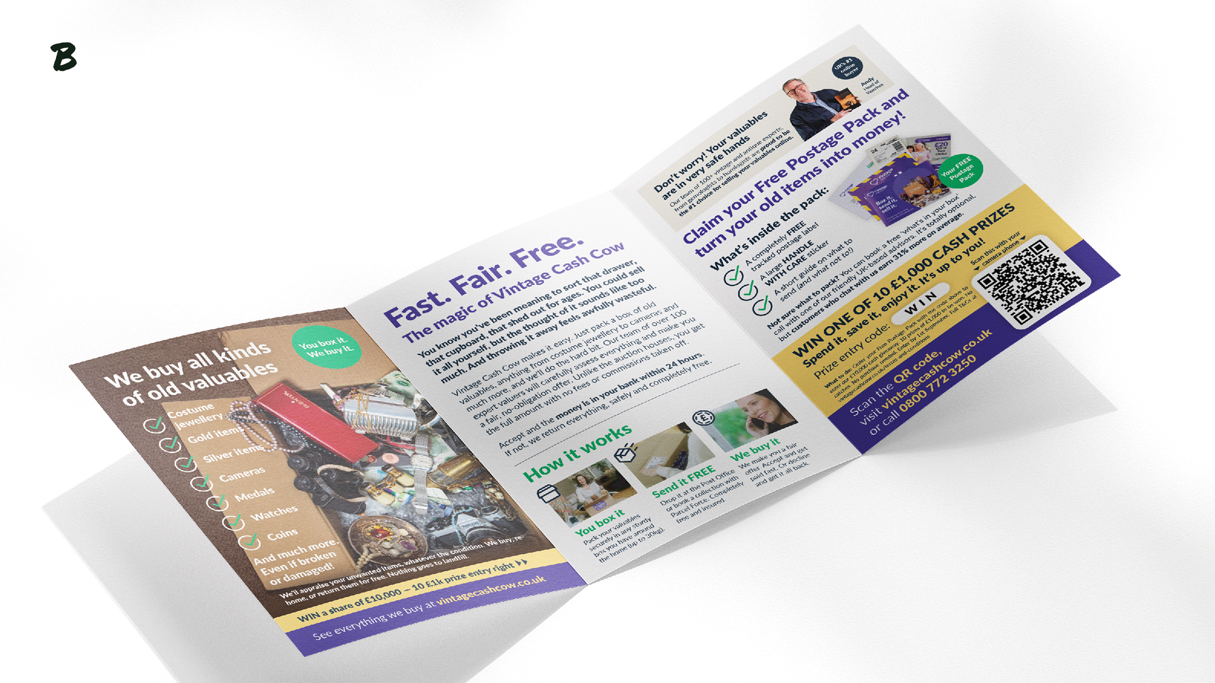
Organised: No copywriting structure in play. The control hopped between messages with no defined sequence. The test followed the reader's logic: problem (still not got round to sorting your bits and pieces out?), reveal (your items could be worth more than you think), proof (over £35 million paid out since 2015), action (order your free postage pack).
Persuasive: The magic moment was missing. Vintage Cash Cow's entire proposition is: your old stuff turns into money. The control buried that behind box photos and process steps. The test showed items on one side and the payout on the other — the visual "ta-da" that makes someone think "I've got stuff like that."
Valuable: The control drew attention to the least valuable part of the transaction — a cardboard box they don't even supply. The test started with the reader's problem: you've got stuff sitting around that you keep meaning to sort out. It positioned the free postage pack as the easiest next step, not the discount code.
The result
280% uplift. Same format. Same audience. Same channel. The only thing that changed was what the creative communicated and how.